# writing-mode 不能说的秘密
控制所有元素的布局方向
控制文本水平或垂直排序
会影响后代子元素的排序
# 兼容性
# 属性值
horizontal-tb默认值,水平方向从左到右vertical-rl垂直方向排序,从左到右vertical-lr垂直方向排序,从右到左
# 案例
- 布局准备
<body>
  div>ul>li{我是li$$}*20
</body>
1
2
3
2
3
<style>
  * {
    margin: 0;
    padding: 0;
    list-style: none;
  }

  div {
    position: absolute;
    top: 0;
    left: 0;
  }

  ul {
    height: 400px;
    border: 2px solid red;
    padding: 8px;
  }

  li {
    padding: 5px;
    border: 1px solid #0ff;
    line-height: 1.5em;
  }
</style>
1
2
3
4
5
6
7
8
9
10
11
12
13
14
15
16
17
18
19
20
21
22
23
24
25
2
3
4
5
6
7
8
9
10
11
12
13
14
15
16
17
18
19
20
21
22
23
24
25
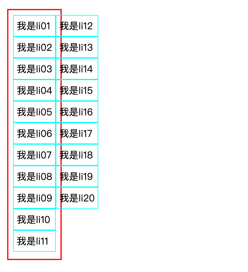
- 垂直方向布局,很多人会马上想到弹性盒子里面的
flex-direction: column
ul {
    height: 400px;
    border: 2px solid red;
    display: flex;
    flex-direction: column;
    flex-wrap: wrap;
    align-content: flex-start;
    padding: 8px;
  }
1
2
3
4
5
6
7
8
9
2
3
4
5
6
7
8
9
虽然能实现垂直方向布局,但是,无法撑大父元素的宽度
列表的高度在
row模式下增加,但其宽度在column模式下不增加更改
column模式高度时,根本没有元素的立即重排,而是处于row模式中
- 所以,我们还可以使用
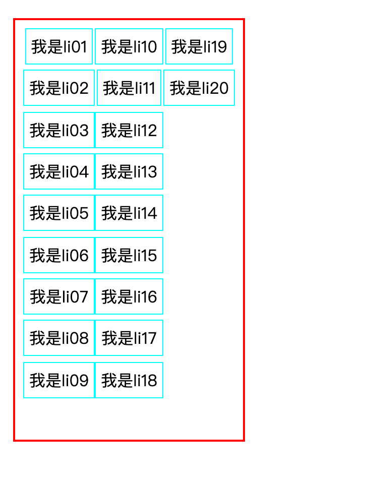
writing-mode属性改变布局方向
ul {
  height: 400px;
  border: 2px solid red;
  padding: 8px;
  writing-mode: vertical-lr;
}

li {
  padding: 5px;
  border: 1px solid #0ff;
  line-height: 1.5em;
  display: inline-block;
  writing-mode: horizontal-tb;
}
1
2
3
4
5
6
7
8
9
10
11
12
13
14
2
3
4
5
6
7
8
9
10
11
12
13
14
- 实现垂直方向布局,并且撑大父元素的宽度,注意要在 子元素重新调整排序顺序,不然会影响布局